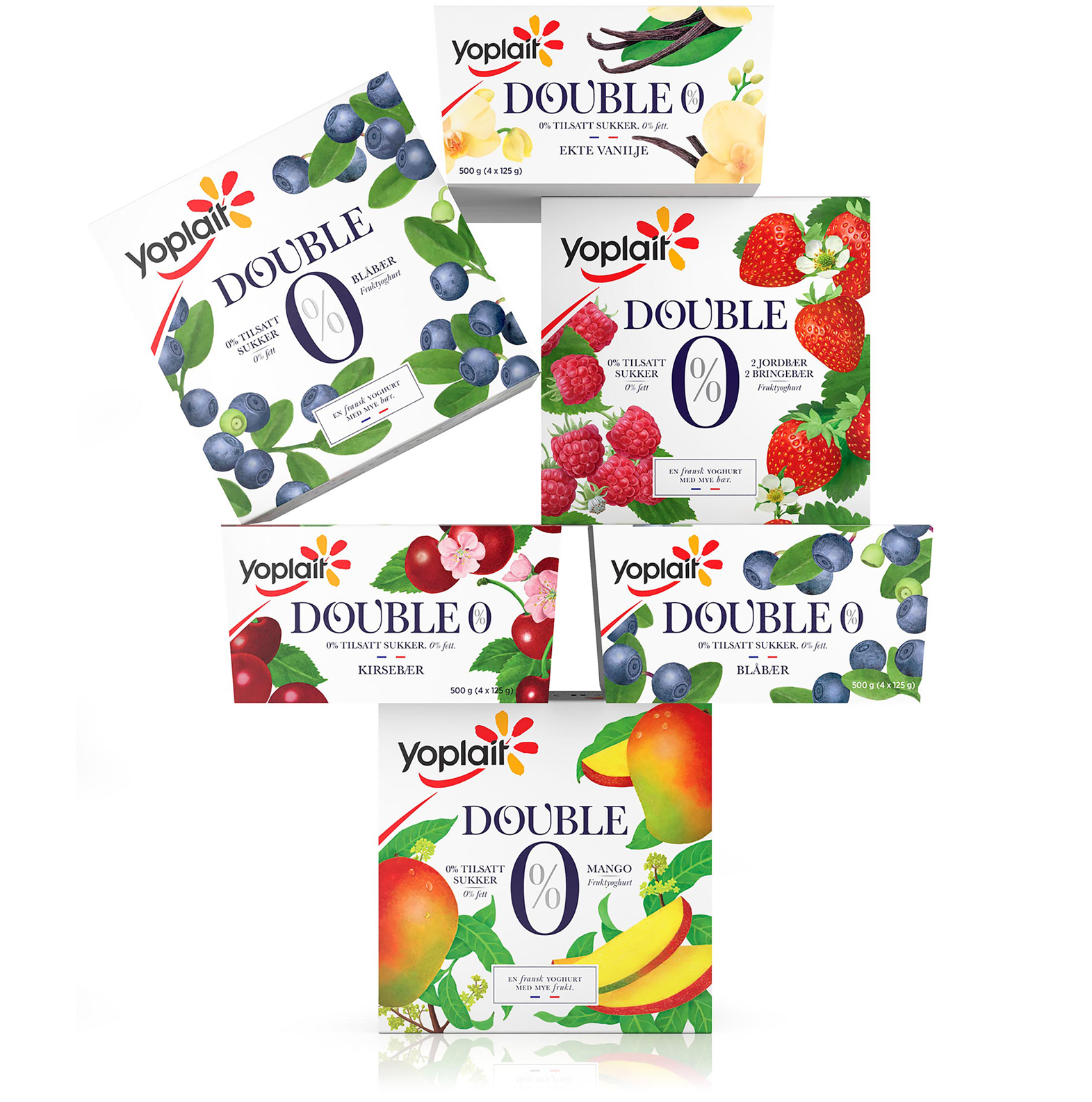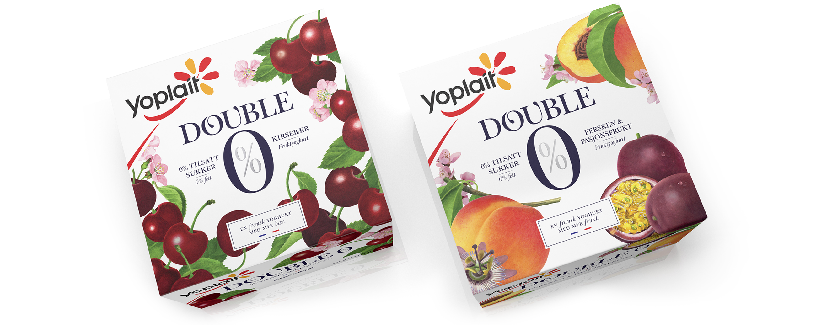

Yoplait Double 0% is a French low calorie yogurt that contains 0% fat, 0% sugar and twice the fruit of all other yoghurt brands in Norway. In response to changing consumer behaviours, which has seen a move from strict dieting to an everyday healthy lifestyle, and recognising that the original packaging struggled to communicate the yoghurt’s flavourful high fruit content, we were challenged to develop a new design.
LOGOTYPE – HAND DRAWN TYPOGRAPHY
Our approach evolves perceptions. It moves Yoplait Dobbel 0% away from tired category conventions and the perception that diet products lack flavour, towards a rich, fruity yogurt full of natural taste without the calories. We did this using prominent hand drawn illustrations, a natural but rich colour palette, and emphasised with white. These frame a strong logotype that brings together the reassuring quality of a serif, makes a connection to illustration and the French provenance of Yoplait through small flourishes and its own hand crafted build. Our layout places a lot of weight on health but balances this with natural flavour.