Vesteraalen Omega-3 is produced from Norwegian Arctic cod caught by local fishing boats in the clean cold waters off the coasts of Vesterålen, Lofoten and Senja. By reducing the time between fresh catches and oil production, Vesteraalen Omega-3 has a unique quality, neutral taste, low odour and high stability that retains the essential and beneficial fatty acids EPA and DHA.
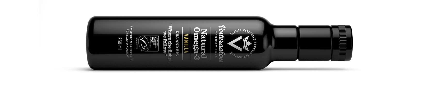
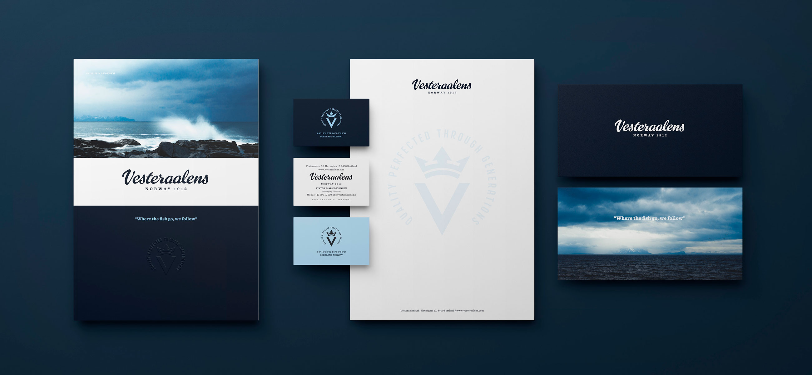

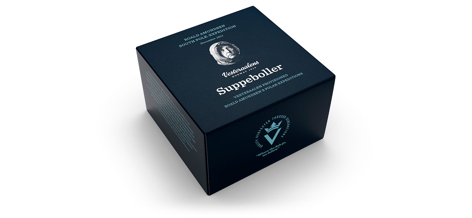
LOGOTYPE – HAND DRAWN TYPOGRAPHY
Our redesign of Vesteraalens’ visual identity and packaging emphasises the fresh, cold and mysterious nature and extreme weather of the region. Our hand-drawn logotype references the brand’s iconic past in a modern, approachable way consistent with the brand’s strong personality.