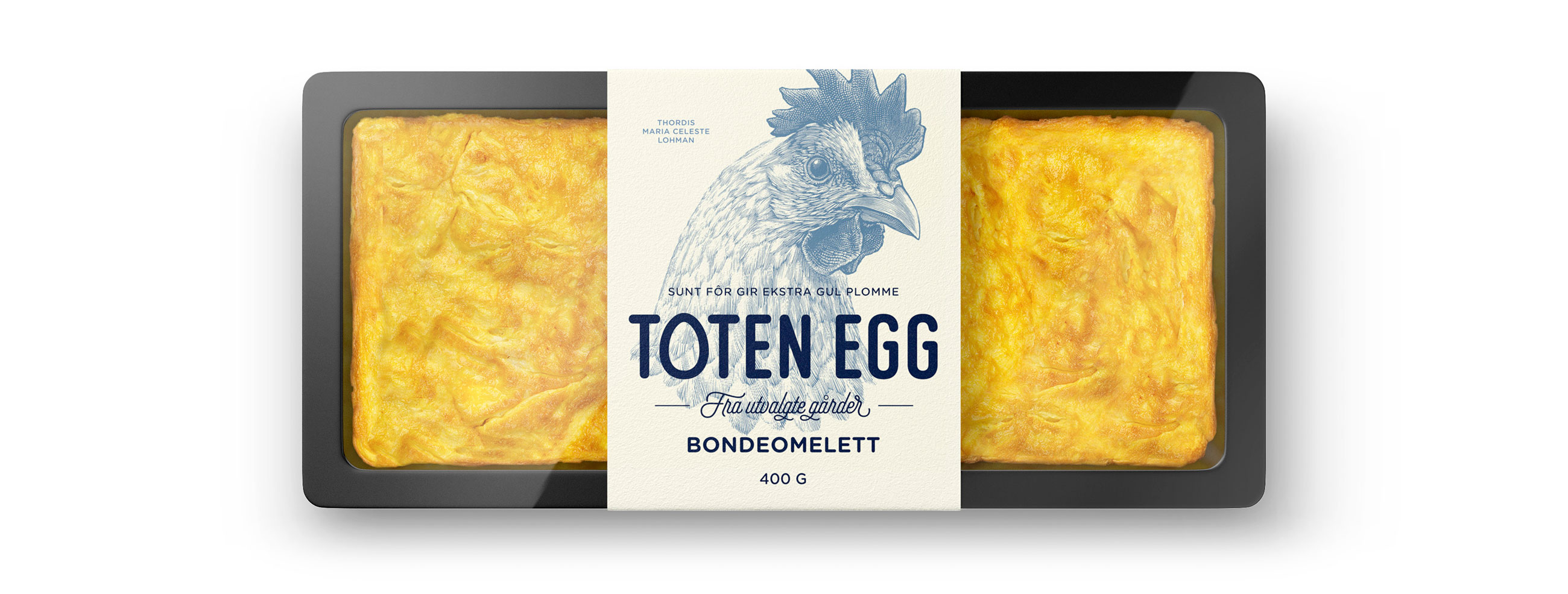


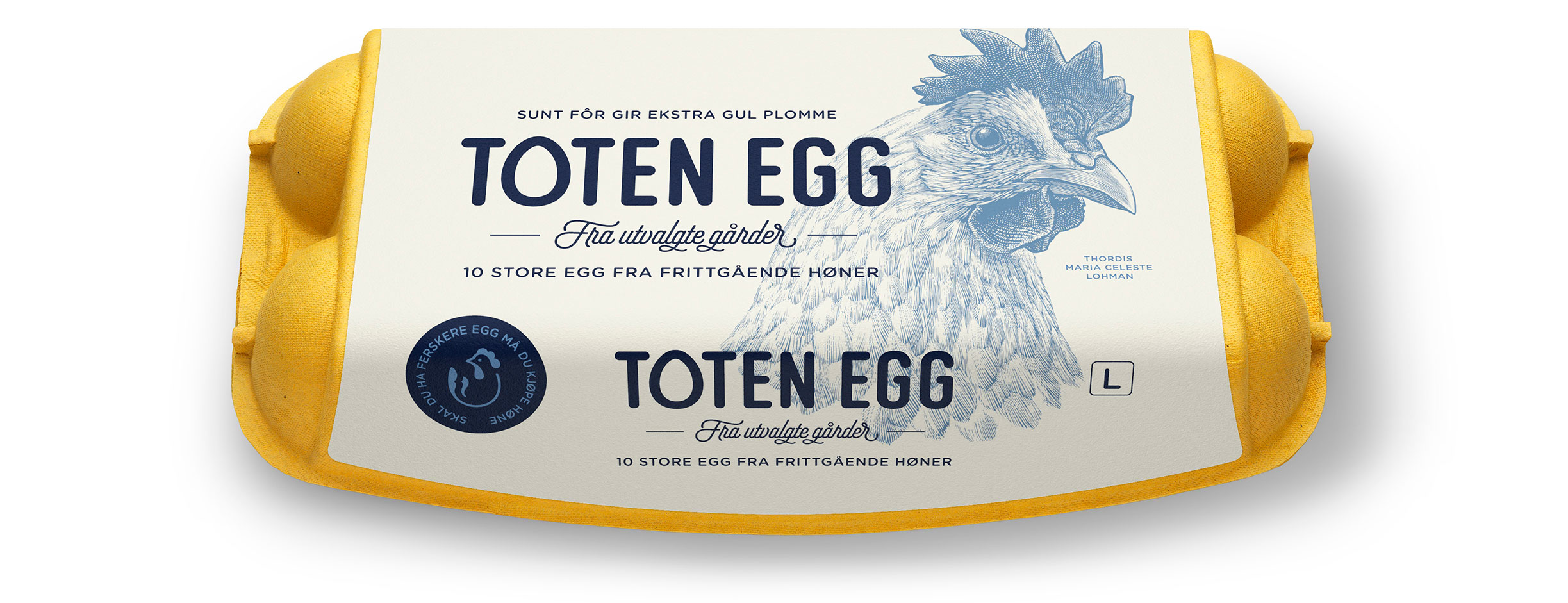
Toten Egg is small local distributer of free range eggs produced by family run farms in eastern Norway, four of which have been adapted to organic production. Chickens are fed on Toten Egg’s special blend of natural feed for flavourful yellow eggs. By directly sourcing from local farms and keeping storage times to a minimum these are unmatched in their freshness.
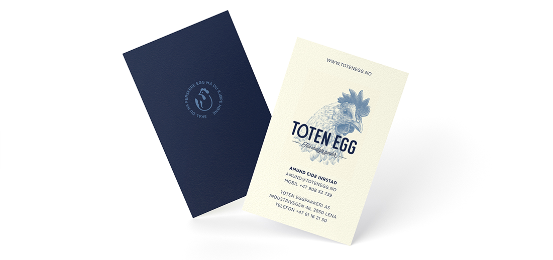
LOGOTYPE – HAND DRAWN TYPOGRAPHY
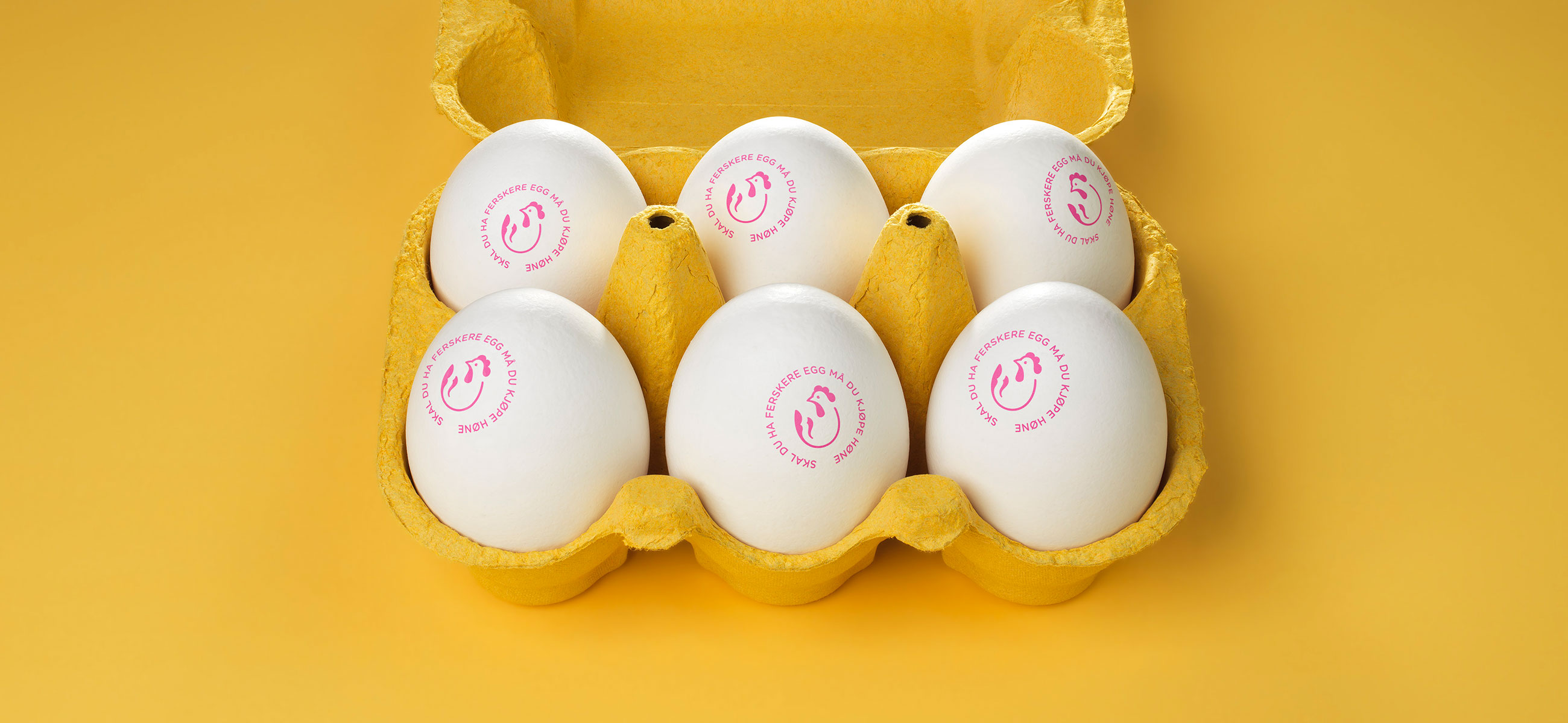
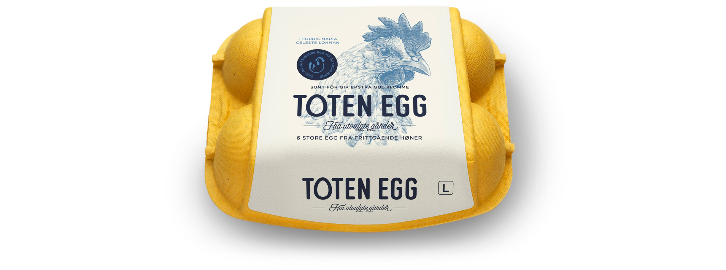
We developed a distinct packaging design that brings together an eye-catching coloured carton and contrasting white label to really emphasise a uniquely yellow egg and its freshness. By mixing the playful qualities of a custom logotype with details like the hen’s name, we foster a more personable and closer connection to the brand, its farmers and their hens, while the craft of illustration and the flourish of a script convey quality and traditional values.