NO / EN
St. Michael nuts nøtter, triple crunch. Emballasje packaging design.
BRAND REDESIGN / PACKAGING / VISUAL IDENTITY / TYPOGRAPHY / LOGO

The American Dream

With a desire to draw the eye of the younger snack market we brought to life the original St. Michael brand, giving it a new personality that would conjure up the past for a loyal and trusted customer base as well as appeal to a younger consumer drawn to all things retro.
St. Michael nuts nøtter logo. Visuell identitet visual identity.

LOGOTYPE – HAND DRAWN TYPOGRAPHY

St. Michael nuts nøtter, peanuts peanøtter, triple crunch. Emballasje packaging design.
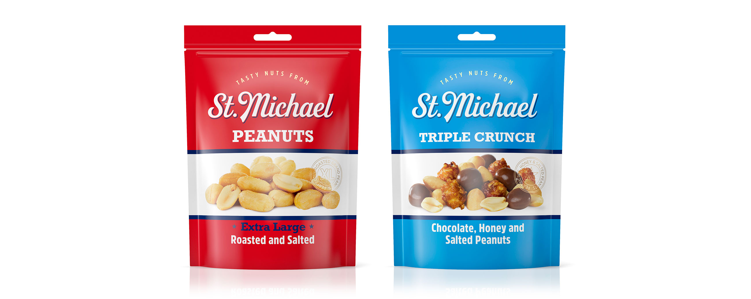
By repositioning the brand, moving it away from its former Britishness and embracing an American attitude, we made a connection with an American generosity, quantity and enduring snack culture whilst remaining simple and product-focused.
Big flavour is central to the brand. We expressed these ideas through large product photography, solid blocks of colour and robust type, and introduced the crafted, baseball-inspired character of a new St. Michael wordmark.
St. Michael nuts nøtter, peanuts peanøtter, box boks. Emballasje packaging design.