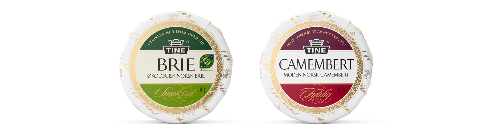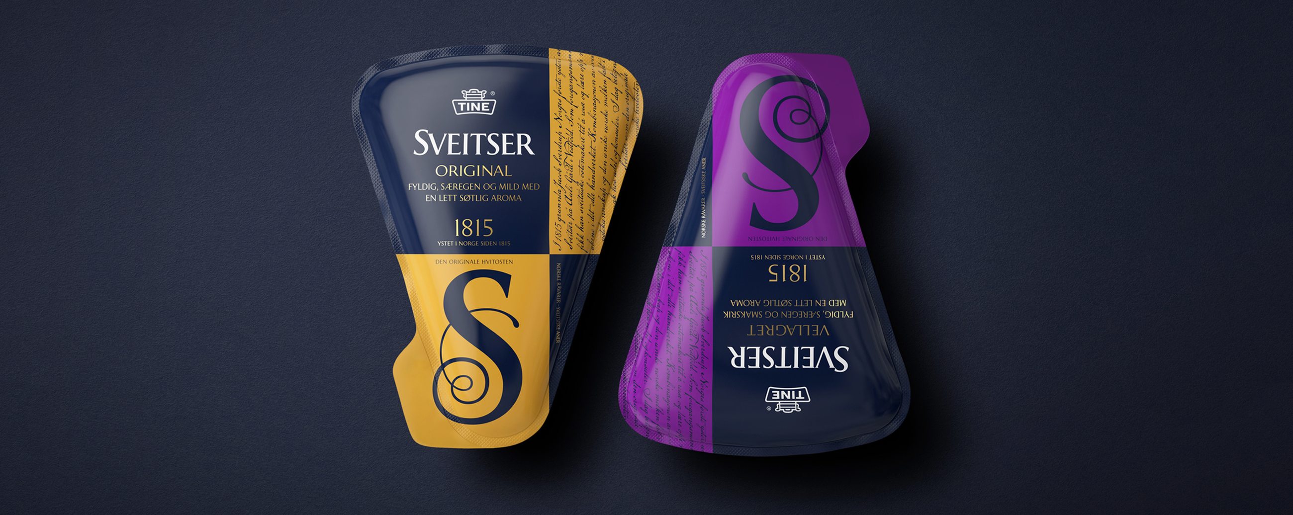
Ostecompagniet has a wide variety of speciality cheeses that have been sourced across Norway. Although each has a unique taste and story to tell they share a craft and care in their production and a high quality in their ingredients. In response to poor grocery store sales we worked with Tine owned Ostecompagniet on crafting a new visual language of difference and individual character.
LOGOTYPE – HAND DRAWN TYPOGRAPHY
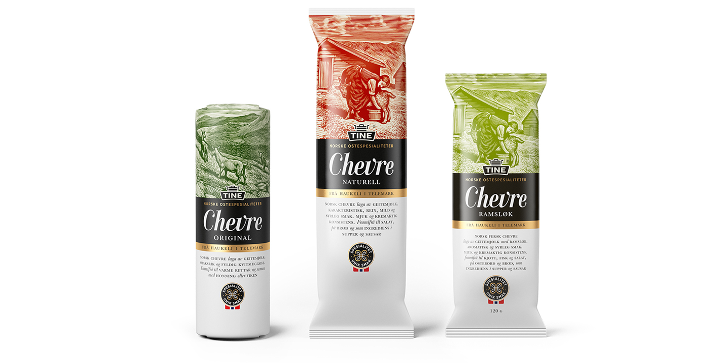
We did this using a distinctive combination of type, image and structure, but with a through line committed to telling the story of each cheese. This approach delivered a fresh and distinctive shelf impact, and followed this up with a level of product insight unique to the market.